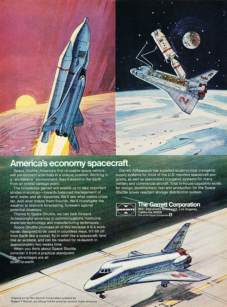
From 1973, a magazine ad for the Garrett Corporation (avionics manufacturer) showing Robert McCall paintings of the Space Shuttle system as then envisioned. At that point, the basics of the Space Transportation System were worked out, but the details were up in the air…
As shown here – which appears to represent a Rockwell design – the Orbiter features a “ridge” down the centerline of the cargo bay doors. This was originally where the manipulator arm (or “arms” as shown here) was supposed to go. The cargo bay was a cylindrical volume, and when filled with a cylindrical payload there would obviously be no room for an arm. So the arm had to fit *outside* that cylindrical volume.
Additional details: it was originally thought that exposed RCS thrusters on the sides of the nose would get roasted on re-entry, so they were hidden behind doors in earlier designs. The proboscis at the front o the ET was a solid rocket motor, used to de-orbit the tank. As originally envisioned, the tank would make it to orbit, or nearly so; it would need to be propulsively de-orbited so that it would come down over the ocean and cause no damage. In the end, the role of the orbital maneuvering system was bumped up so that staging off the ET was carried out just a bit below stable orbit; as a result the ET would naturally re-enter over the Indian Ocean without further effort.
And a lot of early art depicted the Shuttle with lots and lots of paint. Not only on the External Tank, but on the *underside* of the orbiter. I assume that this is just artistic license rather than anyone actually believing that white paint would survive re-entry.
