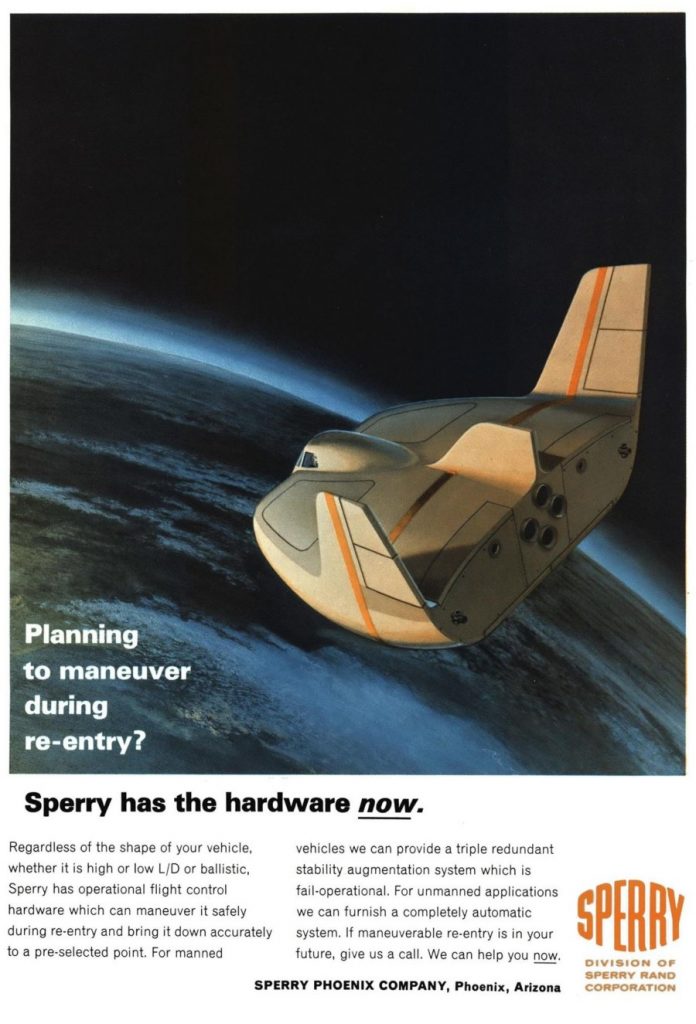
A magazine ad from 1966 depicting a lifting body in space. The design seems reasonable (sort of a cross between the M2 and the HL-10) but could very well be a product not of engineers but of the art department. The angle is not the most informative, but it appears that this design has something of a squared-off nose. Note that the cockpit canopy is exposed, something that very few small lifting body re-entry vehicle designs had… for the simple reason that the windows would likely melt during re-entry, and that would defeat the purpose in making the thing recoverable (along with likely damaging pilot morale). As vehicles get bigger, such as the space shuttle, the windows get further away from the nose and can be made survivable. But little designs like this? Not very likely with 1960’s tech. Otherwise, though, it is an attractive illustration.
Jan 272019

“The design seems reasonable 9sort of a cross between the M2and the HL-10”
Could you correct it please?
What? You want some basic effort to be expended on minimal editing? Pfff. That’s like, work, man.